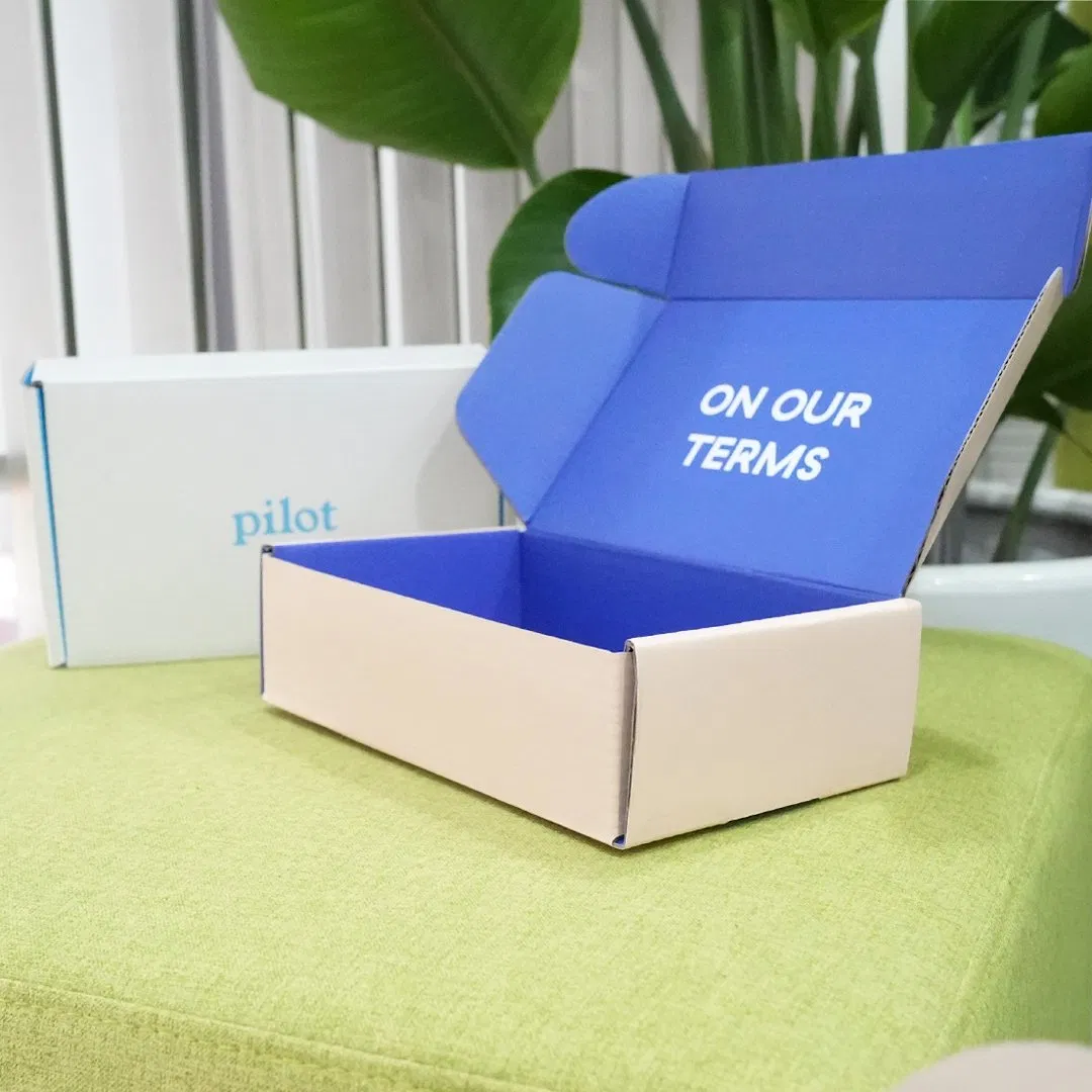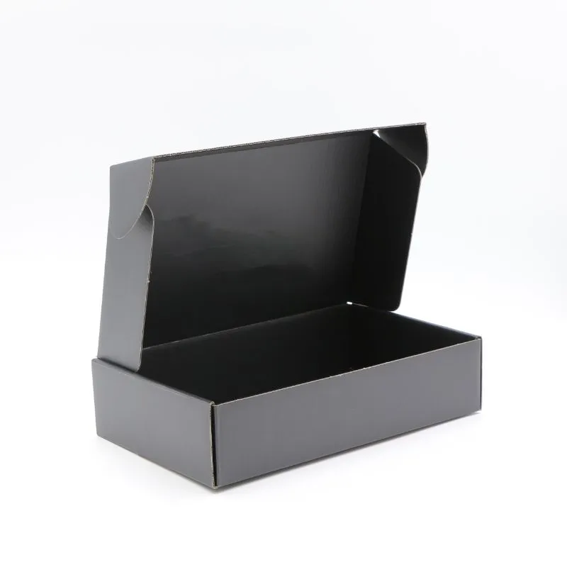
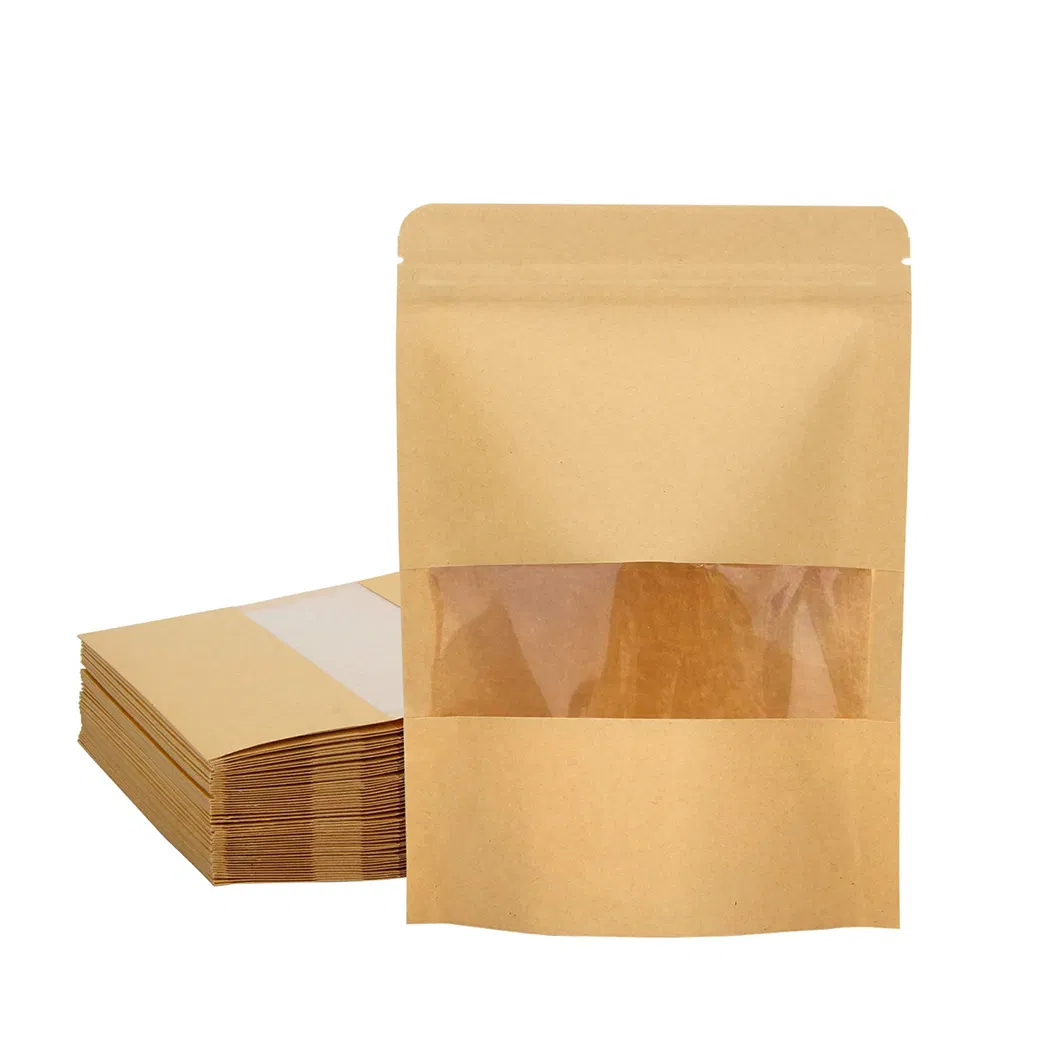
The choice between brown kraft board and bright white board is one of the first aesthetic decisions in a packaging project, and it shapes far more than colour. It changes how your print reproduces, how photographs of the box come out, what the packaging says about your brand, and — modestly — what it costs. Neither is better in the abstract. This guide sets out the real differences so you can pick the surface that flatters your product rather than fighting it.
The two surfaces
Kraft board keeps the natural brown colour of the wood pulp it is made from. It is unbleached, which gives it that warm, honest, slightly rustic look and a pleasant matte texture. White board has been bleached (or given a white top liner) to produce a clean, neutral surface — either a natural-feeling matte white or a coated, smoother white designed for high-quality print.
Both are widely available across folding cartons and corrugated, and both can be specified on FSC-certified stock on request. The decision is about appearance and print behaviour, not sustainability — recycled and certified options exist in both.
How print behaves on each
This is where the surface matters most, because print does not sit on kraft the way it sits on white.
Printing on kraft
Kraft is a coloured, absorbent surface, and it behaves like tinted paper under a watercolour. Every ink you lay down is affected by the brown beneath it. Dark colours — black, deep blue, forest green — print richly and look superb. But light and bright colours struggle: yellow almost vanishes, pale blue turns muddy, and there is no such thing as printing "white" on kraft with standard process inks, because CMYK printing has no white ink. If you need white on kraft, it requires a special white ink pass or spot colour, which adds cost.
The upshot: kraft is at its best with one or two well-chosen darker colours, or a bold single-colour logo. It rewards restraint and punishes busy, colourful artwork. Our overview of packaging printing methods explains why the ink-and-substrate relationship changes with the print process, too.
Printing on white
White board is a blank, neutral canvas, so colours reproduce as intended. Bright yellows stay bright, skin tones in photography look natural, and gradients and fine detail hold up well — especially on a coated white stock. If your packaging carries full-colour photography, complex illustration, or a brand palette built on light and vivid tones, white is very nearly compulsory.
What it does to your photography
Do not forget that your packaging will be photographed — on your website, on marketplaces, on social media. Kraft photographs with warmth and texture; it reads as artisanal, natural, considered. It suits coffee, wholefoods, craft goods, refill brands and anything trading on an honest, unfussy identity. White photographs as clean, modern and premium-neutral; it suits cosmetics, tech, clinical or contemporary brands, and any product where colour accuracy on screen is commercially important. Picture the finished box in a product photo before you commit — the surface sets the mood before a single word is read.
The cost difference
As a rule, unbleached kraft board costs slightly less than bleached white board, because it skips the bleaching stage. The saving is usually modest rather than dramatic, and it can be outweighed in either direction by your print choices: a simple one-colour job on kraft is genuinely economical, whereas needing a white-ink underprint on kraft to make colours pop can wipe out the material saving entirely. White board with full CMYK is a mainstream, well-priced combination and rarely the expensive option people assume.
In short, do not choose kraft purely to save money. Choose it because the look suits your brand, and enjoy the small saving as a bonus. If cost is your main concern, our broader guide to what custom packaging costs in the UK puts the material choice in context alongside the bigger price drivers.
A quick way to decide
- Choose kraft if: your brand is natural, artisanal or eco-minded; your artwork is simple and uses dark or earthy colours; you want texture and warmth in product photos.
- Choose white if: you print full-colour photography or bright artwork; colour accuracy matters; your brand reads clean, premium or contemporary.
- Consider a mix: kraft outer with a white printed sleeve or label, or a white box with kraft inner packaging, can give you the best of both.
Texture, coatings and the feel in the hand
Surface choice is not only about colour — it changes how the box feels, and touch is part of how customers judge quality. Uncoated kraft has a natural, slightly tactile finish that suits a hand-made or honest brand and takes a matt varnish well. Coated white can be finished with a gloss or matt laminate for a smoother, more premium hand-feel, or given a soft-touch coating for that velvety texture associated with cosmetics and gifting. Those finishes read very differently on the two surfaces, so it is worth deciding surface and finish together rather than in isolation.
Bear in mind, too, that heavy lamination complicates recycling regardless of the board beneath it. If a clean recycling story matters to your brand, an uncoated kraft or an unlaminated white with a simple varnish keeps the box in a single material stream while still looking considered. It is a small decision that quietly affects both the feel of the pack and its end-of-life story.
The safest thing is to see your own artwork on the actual board before a full run. Tell us your colours and the look you are after, and we will advise which surface will do them justice when you request a quote — and steer you away from combinations that will disappoint once printed.