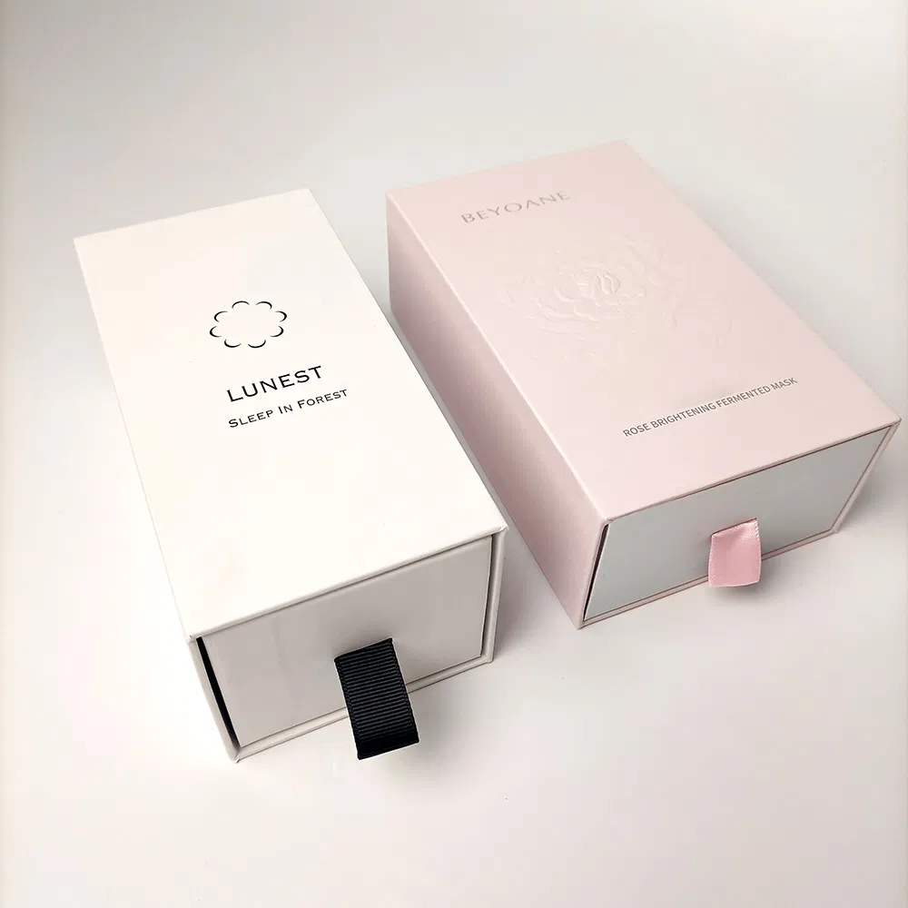

Foil blocking is the finish people reach for when they want a box to feel expensive, and when it is done well it earns its keep. Done badly — too much of it, in the wrong place, on the wrong board — it looks like a supermarket birthday card. This guide explains what actually happens on the machine, what the different foils do to your budget, and where a light touch pays off.
What foil blocking actually is
Foil blocking, sometimes called hot foil stamping, is not printing. There is no ink involved. A metal die is engraved with your design, heated, and pressed against a thin film of metallic or pigmented foil so that the foil transfers onto the board only where the die touches. The result is a crisp, reflective mark sitting slightly proud of the surface, with an edge far sharper than any printed metallic ink can manage.
Because it uses a custom die, foil is a separate process with its own set-up. That has two consequences worth remembering: the design needs to suit a stamped edge — fine hairlines and tiny serifs can fill in or fracture — and it is a different economic beast from the CMYK print underneath it. If you are still weighing up print methods generally, our comparison of litho, digital and flexo sets the scene before finishes come into play.
Gold, silver and the coloured foils
Gold and silver are the workhorses, and they cover most requests. Within each you get a range — a warm rich gold versus a paler champagne, a bright mirror silver versus a softer satin. The finish also varies: high-gloss foil throws a hard reflection, while a matt or brushed foil reads as more restrained and, to many eyes, more modern.
Beyond the metals, foils come in flat pigment colours (a solid white foil on kraft is a lovely, quiet effect), holographic and rainbow foils, and clear gloss foils that add shine without colour. Coloured pigment foils generally sit at a similar cost to the metals; specialist holographic foils can cost a little more and are harder to keep looking tasteful. As a rule, the more unusual the foil, the easier it is to overdo.
The cost logic
Foil pricing breaks into two parts. First, a one-off charge for the engraved die — a small, simple logo die is inexpensive; a large or intricate one costs more, and you keep it for repeat runs. Second, a per-unit cost for the stamping pass itself, which scales with the foiled area and the run length. A postage-stamp-sized logo foiled on 500 boxes adds only pennies each; a foil that covers a third of the lid is a different conversation.
Two honest points. There are no set-up fees on our jobs in the ordinary sense, but a foil die is a genuine tooling cost we pass on at cost rather than a margin-padding admin charge. And foil rewards restraint economically as well as visually: a small, well-placed mark is cheap and looks considered, whereas flooding a box with foil is both expensive and, oddly, less impressive. For a sense of how finishes read across different formats, our portfolio is the quickest reference.
Board and colour underneath matter
Foil sits best on a smooth, firm surface. It looks superb on rigid box wraps, matt-laminated cartons and coated boards; on rough, uncoated recycled kraft the transfer can be slightly less even, which some brands actually like for its handmade character. If you are foiling onto kraft, ask for a sample — the effect is charming but not glassy.
Think too about contrast. Gold on deep navy or matt black is the classic for a reason: the metal has something dark to shine against. Silver foil on a pale grey box, by contrast, can nearly vanish. Because foil has no ink of its own, the board colour is effectively half of the finished effect.
Pairing foil with other finishes
Foil combines beautifully with texture. A logo that is both foiled and embossed — stamped and raised in one pass, or in two registered passes — has a depth that flat foil cannot match, and it is one of the finishes behind a great many premium lids, as our guide to luxury rigid boxes shows. Foil over a matt laminate is another dependable combination: the dead-flat matt makes the metal look brighter by contrast. What to avoid is stacking foil, spot UV, emboss and heavy print all onto one small panel; the finishes start competing rather than reinforcing.
Getting the artwork right
Supply the foil element as its own layer or spot colour, clearly labelled, not merged into the CMYK artwork. Keep lines above roughly 0.5pt so they survive the die, avoid very small reversed-out text, and remember that foil cannot be tinted or graded — it is either there or it is not, at full strength. Our free dieline templates give you the box outline to build on, and if you are unsure how to set up a foil layer, our guide to print-ready artwork walks through spot colours and layers in plain terms.
When foil is worth it — and when to skip it
Foil earns its place on gift boxes, premium retail cartons, cosmetics, spirits and anything where the box is part of the perceived value. It is largely wasted on plain shipping outers and on boxes the customer will recycle in seconds without a second glance. If your margins are thin and the box is pure logistics, spend the money on getting the fit right instead.
If foil is right for your product, the sensible next step is a quote that shows the die cost and the per-unit foiling separately, so you can see exactly what the shine adds. Tell us the box, the run size and where you want the foil, and we will come back — usually within one working day. Request your free quote here.