"It looked exactly right on my screen" is the sentence behind a great many disappointed brand owners. Colour on a box is not the colour on your monitor, and the gap between the two is where a lot of quiet frustration lives. Understanding the difference between Pantone and CMYK — and being realistic about what print can and cannot do — is the difference between a box that looks like your brand and one that looks nearly like your brand.
CMYK: mixing colour from four inks
CMYK — cyan, magenta, yellow and black — is process printing. Every colour is built from tiny dots of those four inks, and it is how full-colour photographs and the vast majority of packaging get printed. It is flexible and cost-effective: one four-ink set-up prints any image you like.
The catch is that CMYK cannot hit every colour. Bright oranges, vivid greens, deep purples and anything approaching a fluorescent sit outside what four process inks can mix, and CMYK's attempt at them comes out muted. It is also slightly variable run to run — a CMYK build of your brand blue may drift a touch between one order and the next, because it is a recipe of four inks rather than a single fixed colour.
Pantone (PMS): a single, pre-mixed ink
A Pantone or PMS spot colour is a specific ink, mixed to a recipe before it goes on the press, matched to a numbered swatch in a physical book. Because it is one solid ink rather than a screen of dots, a Pantone colour is cleaner, more consistent, and can reach vivid or unusual shades that CMYK cannot. If your brand blue is Pantone 286, specifying 286 gets you the same 286 this year and next.
Spot colours cost more to set up — each is a separate ink on the press — so they make most sense when colour consistency genuinely matters to the brand, or when you need a colour CMYK cannot reach. Many packaging jobs use a sensible hybrid: CMYK for photographs and general artwork, plus one Pantone spot for the logo colour that has to be exactly right every time.
When PMS is worth paying for
- A distinctive, recognisable brand colour — the sort a customer would notice if it drifted. Consistency across every touchpoint is worth the spot ink.
- A colour outside CMYK's reach — a bright, deep or near-fluorescent shade that process printing renders flat.
- Large flat areas of a single colour, where any CMYK dot pattern or variation shows most obviously.
- Repeat orders, where run-to-run consistency across time matters more than on a one-off.
Conversely, if your box is mostly photographic, your colours sit comfortably within the CMYK range, and consistency to a fraction of a shade is not critical, CMYK alone is the pragmatic and cheaper choice. There is no prize for over-specifying. For the wider picture of how print method interacts with all this, our comparison of printing methods is worth a look — digital, for instance, simulates spot colours rather than laying down a true spot ink.
Why kraft board shifts your colours
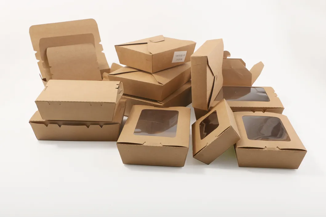
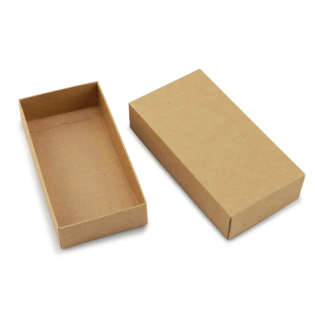
Here is the trap that catches the most people. Pantone books and screen previews assume a white surface. Print the same ink onto brown kraft board and it changes — sometimes dramatically. Inks are semi-transparent, so the brown beneath tints everything: your clean blue turns muddy, your bright red warms towards brick, and anything pale or pastel may barely register at all. White ink on kraft needs a dedicated white pass or it simply vanishes into the board.
This is not a fault; it is physics, and it can be lovely when you plan for it — earthy, warm, honest colours suit the kraft aesthetic. But it means you cannot judge a kraft job by a swatch printed on white. If you are choosing between stocks, our comparison of kraft versus white packaging covers the trade-offs, and the short version for colour is: kraft for muted and natural, bleached white for bright and true. If a colour must be exact, print it on white — or accept, knowingly, how kraft will change it.
Realistic expectations
Even done perfectly, packaging colour comes with honest caveats worth internalising before you approve anything:
- Your screen is not the box. Monitors emit light; boxes reflect it. A colour always looks more vivid on screen than in the hand.
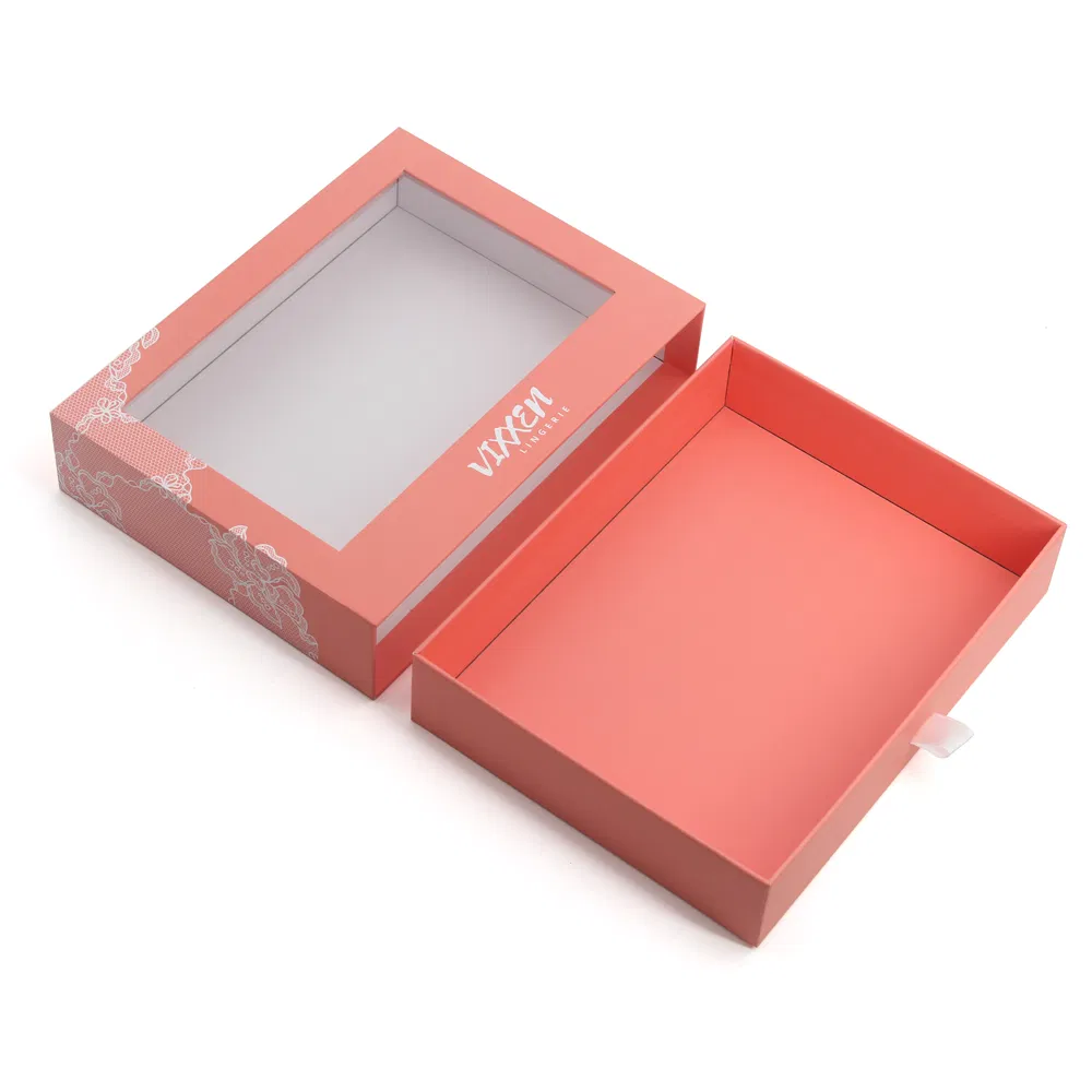
- Finish changes colour. A matt laminate slightly mutes and deepens; a gloss laminate lifts and brightens the same ink. Judge colour on the finish you will actually use.
- Small variation is normal. Print tolerances mean a tiny shift between runs is expected, not a defect — which is precisely the case for a spot colour if the shade is sacred.
- A physical proof settles the argument. For any critical colour, approve it on real stock, not a PDF — a point we make in our guide to checking packaging proofs.
Getting it right in the file
Specify Pantone references explicitly where they matter, rather than letting your software convert them to CMYK silently. Label any spot colour clearly on its own channel, and supply artwork built on the correct dieline — download the right one from our free templates to start clean.
If colour is central to your brand, tell us your Pantone references, your board and whether you want a spot colour or a CMYK build, and we will advise on what to expect on your chosen stock — including the honest news about kraft. Request a quote here and we will normally reply within one working day.