Approving a proof is the last moment errors are free. After sign-off they are printed onto a few hundred boxes, and the fix is a reprint you pay for. It is worth slowing down for the ten minutes it takes to check a proof properly, because that ten minutes is the cheapest insurance in the whole process. This is a practical guide to what to look at — and to the difference between the two kinds of proof you will be sent.
Digital proof versus physical sample
A digital proof is a PDF or on-screen visual of your artwork placed on the dieline. It is quick, free and turned around fast, and it is the right tool for checking everything to do with content and layout: spelling, positioning, sizes, barcodes, the fold logic. What it cannot honestly show you is colour — every screen is calibrated differently — or the physical feel, the sheen of a finish, or how a fold sits in real board.
A physical proof or pre-production sample is an actual box, printed and made up. It shows you colour on your real stock, the true effect of a matt or gloss laminate, how foil sits, and whether the box assembles cleanly. It costs more and takes longer, so it is not warranted for every job — but for a first run of a premium box, or anywhere colour is critical to the brand, it is money well spent. The two proofs answer different questions, and knowing which question you are asking stops you trusting a screen for something only board can tell you.
A practical pre-approval checklist
Run through this every time, ideally with a second pair of eyes, because you stop seeing your own mistakes after the third read.
Text and content
- Spelling and grammar on every panel — including the small print, the website address and the social handles, which are the bits everyone skims past.
- Phone numbers, URLs and email addresses checked character by character, not glanced at.
- Legal and mandatory copy present and correct for your product type. If you are in food or another regulated category, confirm the current requirements against the guidance on gov.uk rather than assuming last year's wording still applies — our overview of food packaging rules explains why this changes.
- Barcodes present, the right numbers, and not shrunk below a scannable size.
Layout and dieline
- Everything on the right panel and the right way up once folded — mentally assemble the box, or better, fold a printed copy of the proof.
- Nothing important near a fold or a cut edge. Text and logos too close to a crease look untidy and can be damaged by the fold.
- Bleed and safety margins respected, so nothing you meant to keep gets trimmed off.
- Interior print, if any, lands the right way up — a classic reversed-panel error, as flagged in our piece on printing inside boxes.
Colour and finish
- Brand colours specified correctly — Pantone references where they matter, not left to a CMYK approximation by accident.
- Finish areas marked accurately — the foil, spot UV or emboss falls exactly where you intend, on a labelled layer.
- Colour judged on a physical sample, never a screen, if colour is critical to your brand.
How this fits with print-ready artwork
Proofing is the safety net; getting the files right in the first place is the trapeze. The two work together — a clean, correctly built file produces a proof with fewer surprises to catch. Our guide to preparing print-ready artwork covers the upstream side (bleed, resolution, spot colours, outlined fonts) so that by the time a proof reaches you, the checklist above is confirming good work rather than uncovering problems. Think of that article as the build stage and this one as the sign-off stage; you want both.
The mindset that catches errors
Two habits catch far more than any list. First, read it aloud — your ear notices what your eye glides over, especially in phone numbers and web addresses. Second, check against the source, not from memory: put your official brand address next to the proof rather than trusting that you would spot a wrong postcode. And give it to someone who did not write the copy; the author is the worst proofreader of their own work, every time.
What approval actually means
When you sign off a proof, you are confirming that the file as shown is what you want printed. Responsibility for anything visible on that proof passes to you at that point — which is exactly why the ten-minute check matters. If something is unclear, ask before approving; a query costs nothing and a reprint costs a run. We would always rather answer a question than watch a preventable error go to press.
Deciding whether to order a physical sample
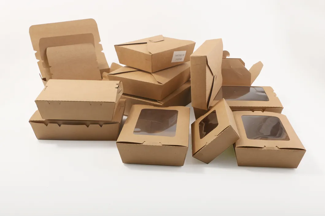
Not every job justifies a physical proof, and it is worth being deliberate about when to ask for one. Lean towards a pre-production sample when colour is central to your brand, when the box carries an unusual finish you have not used before — a foil, a spot UV, a soft-touch laminate — or when it is a first run of a premium format where a disappointing result would be costly to repeat. Lean towards a digital proof alone for reorders of a box you already know, for straightforward CMYK work within a comfortable colour range, and for tighter timelines where the few extra days a physical sample takes would push your delivery. The cost of a sample is small measured against a full reprint, so the real question is rarely "can I afford the sample" but "how much does it hurt if the run is wrong". For anything going onto brown kraft, where colour behaves unpredictably, a physical sample is close to essential rather than optional.
If you are preparing to send artwork or are unsure whether a job warrants a physical sample, tell us the box, the finishes and how critical colour is, and we will advise honestly and turn your proof around promptly. Start a quote here, or get in touch if you have a specific proofing question first.