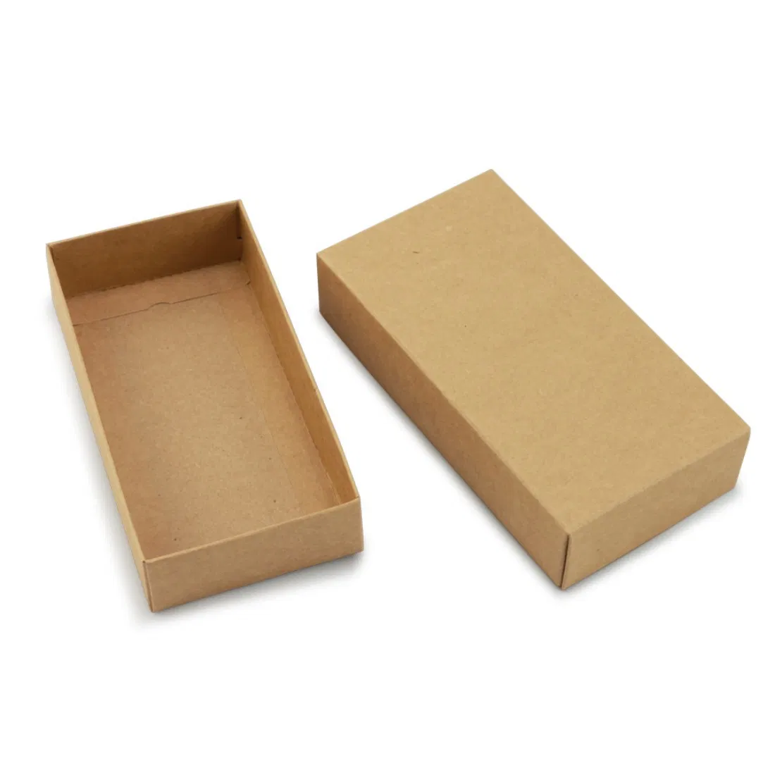
Pantone or CMYK? Getting Brand Colours Right on Packaging
When a Pantone spot colour is worth paying for, why kraft board shifts your colours, and what to expect realistically from print.
Read the guide →
Straight-talking guides on custom packaging — costs, materials, print and sustainability for UK brands.
When a Pantone spot colour is worth paying for, why kraft board shifts your colours, and what to expect realistically from print.
Read the guide →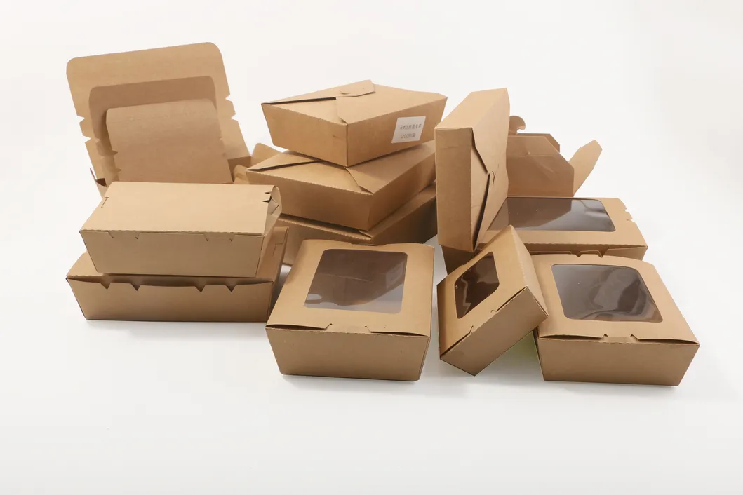
Digital proofs versus physical samples, what each will and will not show you, and a practical checklist to run before you sign anything off.
Read the guide →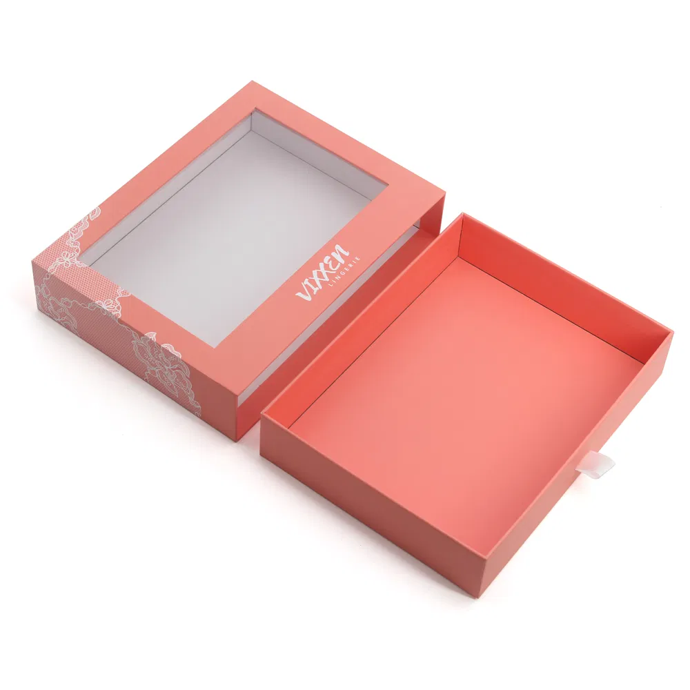
A window lets the product speak for itself, which is powerful for food and gifts. But it complicates recycling — here is the honest trade-off.
Read the guide →
A dieline is the flat blueprint your box is cut and folded from. Here is what it shows, why every supplier needs one, and how to use a free template.
Read the guide →