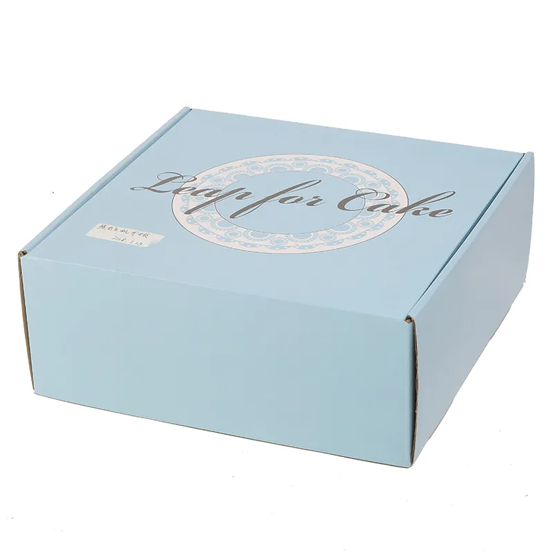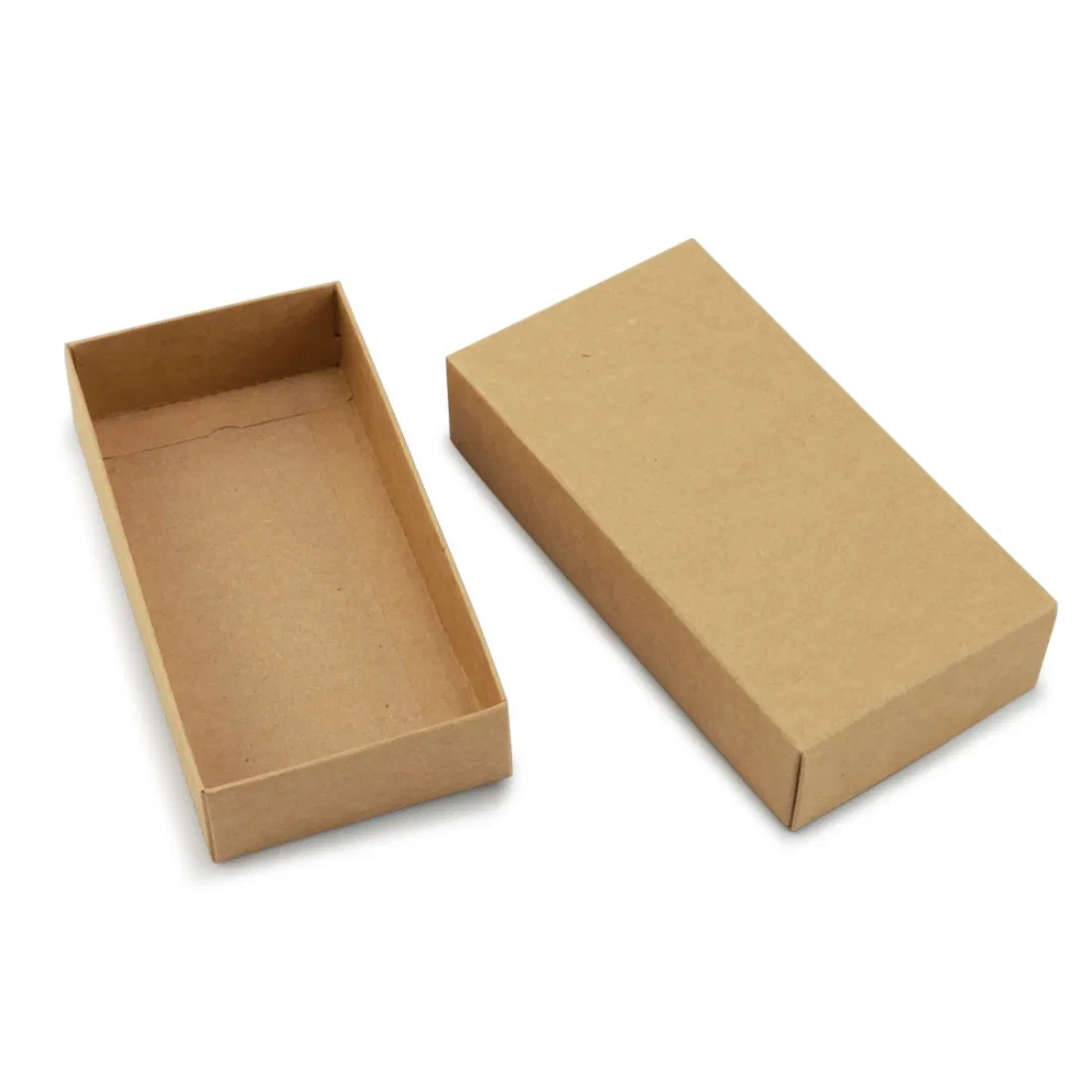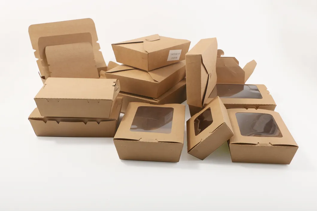
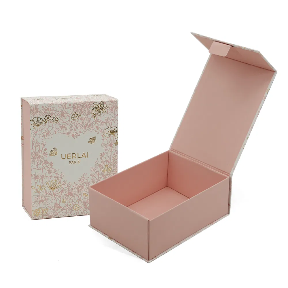
An online brand exists on screens right up until the moment a courier hands over a box — and then, for about thirty seconds, it exists in the customer's hands. That half-minute is the only physical impression most e-commerce businesses ever make. It is strange, then, how many brands spend heavily on the click and nothing at all on the open. Designing the unboxing is not about theatre for its own sake; it is about making a promise feel kept.
Think in sequence, not in parts
Good unboxing is choreography. The customer sees the outer, opens the lid, meets a first layer, uncovers the product, finds the extras. Design each beat deliberately:
- The outer. Clean, confident, unmistakably yours — even a single printed colour on kraft reads as intentional. The address label deserves a straight application; sloppiness here undoes everything inside.
- The reveal. A mailer box opens like a book, which is exactly why the format dominates subscription and D2C brands. Printing the inside of the lid — a colour, a pattern, a line of copy — costs modestly and lands the moment the lid lifts. It is the single best pound-for-pound upgrade in packaging.
- The dressing. Tissue with a sticker seal adds a second of ceremony. Paper shred or a die-cut insert holds the product still so it presents as arranged, not as shaken.
- The extras. A thank-you card, care instructions, a discount for next time. One or two, not five — an inbox of leaflets reads as clutter.
Restraint is the expensive-looking part
The most common unboxing mistake is addition: more colours, more inserts, more slogans. Premium reads as editing — one strong colour, one finish, generous empty space, copy that sounds like a person. A box that says one thing clearly beats a box that shouts six. This is also, conveniently, the cheaper approach: one well-chosen accent (a foil logo, an inside flood colour, a printed tape) outperforms three competing ones at a fraction of the cost.
Words work harder than graphics
The cheapest luxury in packaging is good copy. A dry joke under the lid, a sincere line about who packed the order, instructions that respect the reader's intelligence — people photograph words more often than patterns. Write like you speak, keep it short, and never print "Delight awaits!" on anything.
The social-share point, honestly
Yes, beautiful packaging gets photographed and posted, and an unboxing that customers show off is advertising you did not buy. But design for the customer's private satisfaction first. A box engineered for Instagram that annoys the person opening it — glitter, excessive wrap, ten seconds of tape — optimises the wrong audience. Repeat purchase is the metric; shares are the bonus.
Where the money goes furthest
| Upgrade | Cost | Impact |
|---|---|---|
| Inside-lid print | Modest | High — the reveal moment |
| Tissue + sticker seal | Pennies | High — ceremony and hold |
| Thank-you card with real copy | Pennies | High — human voice |
| Foil or emboss on logo | Moderate | Medium — tactile premium cue |
| Full custom insert | Moderate | Medium-high for fragile or multi-part products |
Match the ambition to the margin
A £9 product does not need a £3 unboxing, and a £90 product should not arrive in a scuffed stock box with a packing slip. As a loose rule, packaging that flatters sits somewhere around 5–10% of the product's price. Selling genuinely premium goods? That is where rigid boxes enter the conversation. Building a subscription experience on a startup budget? An E-flute mailer with inside print and decent tissue gets you 80% of the effect for a fraction of the spend.
If you would like a second opinion on where your unboxing budget will work hardest, talk to us — or browse our portfolio to see how other UK brands have staged the moment. When you are ready, a quote costs nothing and arrives within one working day.