
A subscription box is a strange packaging brief, because it has to do three things that usually pull against each other. It must be repeatable — the same box, month after month, for years. It must be postable — cheap and reliable to send at scale. And it must be memorable — because the unboxing is the moment your subscriber decides whether to stay. Get the balance right and the box quietly does a lot of the retention work for you. Here is how to think it through.
Design for the monthly cadence
Unlike a one-off product, a subscription box repeats on a schedule, so the design decisions you make once get amplified across every cycle. That changes the priorities:
- Design a base box that does not change. Keep the outer box, the size and the construction consistent, and let the contents and any printed insert carry the monthly theme. Reprinting the whole box every month is expensive and slow; swapping a printed card is neither.
- Pick a size that flatters a variable line-up. Some months you will curate light, some heavy. Choose a footprint that looks intentional whether it is comfortably full or lightly filled — a box that rattles when it is a quiet month undermines the treat.
- Plan your reorder rhythm. Predictable monthly volume is a gift: you know roughly how many boxes you need and when. Set a reorder point so you never scramble — our lead times guide explains how to time it.
Weight and postage: the number that repeats forever
Postage on a subscription box is not a one-off cost — it recurs for every subscriber, every month, which means small savings compound into serious money. Two levers matter most:
- Depth. A slimmer box may qualify for a cheaper postal band. If your line-up allows it, designing to a letterbox-friendly depth can cut a recurring cost on every parcel — our guide to letterbox-friendly packaging covers the approach, and you should always confirm current sizes at royalmail.com before committing a dieline.
- Weight. Choose a board that protects the contents without carrying weight you do not need. Heavy void fill and an over-specced box both push you up the price bands. Our note on single versus double wall helps you match board to contents rather than over-building by habit.
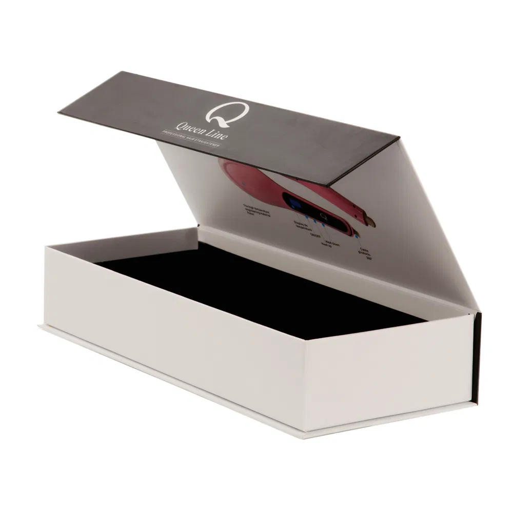
A mailer is the natural home for most subscription boxes — self-locking, no tape, and it opens like a book to reveal your presentation. If you are choosing a format, mailer boxes versus shipping boxes lays out the trade-offs.
Inserts: cheap flexibility that earns its keep
Inserts are where subscription boxes get clever. A die-cut cradle holds each item in place so nothing rattles or arrives damaged, and it makes the box look styled rather than tipped-in. A printed insert card is the cheapest way to make a fixed box feel new every month — a theme, a note, the story behind the picks. Because the card is a small, quick print, you can change it monthly without touching the expensive base box. Our inserts and dividers guide covers the options; if you print the theme on the inside of the box itself, printing inside boxes is worth a look, though a swappable card usually gives you more flexibility.
Memorable, without wrecking the maths
The unboxing is the whole point of a subscription — it is the recurring moment that turns a transaction into an experience and keeps people subscribed. But memorable does not have to mean expensive. A printed interior, a considered insert and a tidy, snug fit do more for the feeling of a box than any single flashy finish. If you do add a finish, one well-chosen touch — a foil-blocked logo or a spot UV detail on an otherwise clean box — reads as considered; three competing ones read as noise. Our guide to designing the unboxing experience for repeat customers goes deeper on this, and repeat business is exactly what a subscription lives on.
Protect against damage — every month, at scale
Damage is a quieter enemy for a subscription than a one-off product, because it recurs. A box style that lets items shift in transit will not fail dramatically; it will simply produce a slow trickle of "it arrived dented" messages, month after month, each one nudging a subscriber toward cancelling. Since the whole model depends on people staying, arriving intact is not a nice-to-have — it is retention. A fitted insert that holds each item still, a board with enough stiffness for the journey and a snug overall fit do most of the work. Our guide to reducing e-commerce damage and returns covers the common failure points, and they all apply here with the volume dial turned up.
Build in consistency
Because the box repeats, consistency is a feature. Lock your brand colours down properly so month twelve matches month one — Pantone versus CMYK explains why that matters — and keep the exact print files versioned so a reorder is a true repeat, not a redesign. Order a physical proof for the first run so you know precisely what your subscribers will hold.
Consistency extends to your stock, too. Because you will be reordering the same base box on a predictable rhythm, it pays to store it well between runs — dry, out of direct sunlight and not crushed under weight — so the box a subscriber opens in month eight looks identical to the one from month one. A faded or softened box quietly signals that standards have slipped, even when the contents are as good as ever.
Subscription packaging rewards planning more than almost any other kind, because every decision repeats. Get the base box repeatable, the format postable and the unboxing memorable, and the packaging keeps working long after you have moved on to next month's theme. Tell us your contents, rough monthly volume and the postal band you want to hit, and we will help you design a box that holds up on all three counts — request a quote or grab a free dieline template to start sketching.


